Share this
by Shelby Black on Tue, Nov 12, 2019 @ 10:30
Building brand awareness needs a strong visual identity. How do you identify your brand from your competitors? People are visual creatures and thus more likely to remember visuals better than text. When done right, these four visual elements will help to strengthen your brand awareness strategy.
1. An Eye-Catching Logo
The first and probably most important visual element for building brand awareness is your logo. Your logo is how your audience sets you apart from the competitors and should be the foundation of your brand identity.
What are some elements of a successful logo? In addition to being easily memorable to everyone, the best logos you see everywhere will generally have the following qualities:
- Simple and streamlined designs: They're easily recognizable without complicated or cluttered elements.
- Versatile across all mediums: When building brand awareness, you need a logo that's not only going to look great on your website but also comes across well on non-conventional platforms like vehicle wraps, billboards or signs.
- Distinct from all competitors: You know who this brand is the moment you see their logo.
- Appropriately designed to match the industry they're in: Toys R Us has a playful look in its logo to appear youthful for its target market.
- Designed to stand the test of time: Coca-Cola has had the same general logo for decades!

2. Brand-Specific Colors
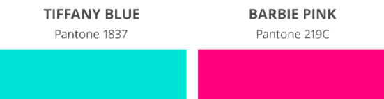
Color can tell you a lot about a brand, without you even realizing it. This is where the emotions and feelings originate from. Having specific brand colors can be useful when building brand awareness. Some brands such as Tiffany & Co. and Mattel Barbie even trademarked their specific Pantone brand colors because they’re that important.
So what do your brand's colors say about you? Here are some fundamental color connotations:
- Blue: Trustworthy, conservative, calm
- Red: Intense, passionate, energetic
- Green: Nature, health, wealth
- Yellow: Playful, happy, optimistic
- Orange: Fresh, youthful, adventurous
- Purple: Spiritual, luxury, royalty
- White: Minimalism, pure, clean
- Black: Sophistication, power, elegance
Of course, none of this is set in stone. However, it's important to understand that, when using color, you have to be aware of what you may be communicating.
3. Typography
Typography is one of the trickiest choices in a brand’s identity. It's not something you can just pick from a drop-down and move on. It should be informed by the shapes in your logo and match the feel of your brand.
When picking your typeface, here are some categories to look into to find the best fit:
- Serif
- Sans-Serif
- Script
- Decorative

Within these categories are even more sub-categories, allowing endless choices for you and your brand!
4. Imagery and Graphics
The last visual element to help strengthen your brand awareness strategy is your imagery and graphics choices. Does it make more sense for your brand to use stock or custom photography? Are your graphics going to be simple and flat, or highly illustrative and full of depth? There are a lot of choices to make here!
Imagery and graphics choices you need to decide on include:
- Photography
- Illustration
- Iconography
- Data Visualization
These choices should not only match the look and feel that you have established so far with your brand identity, but they should also help enhance it.
Your visual brand identity is important to have in a brand awareness strategy, and with these four elements, you're sure to stand out from your competitors.